Feature
Remote Viewing
Morgan Quaintance argues that it is time to rethink how artwork is distributed online

Olia Lialina, Hosted, 2020
‘If actual curating of online stuff can only be done online, it is done by everybody alive and it is called “links”. And if you are able to draw enough quality attention, as a quality broker of dialogue about quality ideas, you will get very many people visiting your curatorial site. And they will be visiting the links you have put there. I think that is actually curating online media, period.’ This 2002 statement from the artist Vuk Cosic, about the presentation of digital art on the internet as opposed to in galleries, is also a succinct description of the most basic activity needed for curating online both to function and to be recognised as such. Unsurprisingly, given the erosion of difference and expressive complexity that standardised web platforms have structurally imposed and normalised over the past two decades, it is also the most widespread form of ‘curatorial’ activity seen in its popular, or lay, interpretation – that is, the perpetual filtration and remediation of either material or immaterial cultural production. It is a model now so pervasive that the vast majority of online functionality is essentially predicated on links and on the comments people make about them. What is also not surprising – given the sudden shift in institutional emphasis from physical spaces to websites, following the closures of museums, galleries and offices in Covid-19’s wake – is the art world’s reliance on this and other reductive models of presenting contemporary art in its most expanded sense. This kneejerk explosion of online presentations has foregrounded the need for examining a still-neglected territory. What are its possibilities and art-historical antecedents? How might the presentation of art on the internet broaden the making and digestion of work? What are the benefits and pitfalls of curating online?
The major preliminary consideration for those devising online presentations of work must be an imagined viewer. Who is watching and what is the nature of the relationship between the interface/gallery and the user/spectator facilitated or demanded by the curator? Almost invariably, the defining characteristic of that relationship is that it is one-to-one, as distinct from the physical gallery in which the reception of artwork can be a communal experience in spaces populated by other visitors, lurking staff or the incorporeal presence of behavioural expectations communicated by disciplinary architectures. The viewer of online exhibitions is often alone and potentially able to engage directly with the screen and the work. In this spectatorial configuration the affective registers, and processes of identification and empathy, are potent communicative channels through which emotional and intellectual engagement can be induced. That is, of course, if the intention is to create a kind of interstitial experience that sits outside the normal flows of everyday life, media communications, and the accelerated hyperbolic and hysterical tone of much interaction online. In our present quarantined realities, where anxiety, flat affect and depression frequently suffocate positive mental states, and where imposed social isolation has amplified levels of metropolitan loneliness to howling pitch, the need to produce avenues of encounter outside the new normal is now arguably paramount.
For some, privileging an affective route may seem too close to the culture industry’s use of emotionally manipulative techniques designed to induce states of passive consumption in audiences through escapism and distraction, but it is important to remember that affect is a complex thing and feeling can itself be a political act. This is the case whether, to borrow literary theorist Sianne Ngai’s distinction, affects – feelings or moods projected by a given stimulus – are positive, in that they provoke an individual to some kind of action, or negative, in that they induce inaction. Ngai’s action/inaction schema, while necessary for her characterisation of ‘negative’ emotions like envy and irritation in her 2005 book Ugly Feelings<,em>, imposes an unnecessary value-based distinction on feelings, but her dichotomy (like all such binary models) does offer a manageable way to perceive some of the complexity of emotion’s tonal palette, even if it does rely on the persistence of standard reactions to emotional phenomena. For curators making exhibitions online, use of this tonal palette need not be monochromatic when working with a one-to-one display medium that offers an express line to interiority. Both ‘positive’ and ‘negative’ affects can be combined and interlinked in modular relationships that could then add further depth and complexity to the viewing of exhibitions. This is something that could be done, but I have yet to come across it. What frequently seems to be the case is that online curatorial projects produce two overarching viewing experiences: ennui and exhaustion. Part of the cause must be an institutional lack of attention and training, not to mention the absence of curatorial precedent, but some part of the cause must also be the subconscious application of a theoretical model of reception that is not fit for purpose.
For decades, various aesthetic positions – from Brechtian distanciation to the formal dictates of Greenbergian purity, and from the minimalist refusal of expressivity (at least in the more poetic terms favoured by some mid-century abstraction) to the spartan and rather contrived notions of communal interaction preferred by certain relational and participatory practices – have favoured a severe and at times bloodless relationship with the production and reception of art, eschewing the numinous and the metaphysical for a strange, almost quasi-scientific emphasis on academicism and a demonstrative relationship with theory (healing the social bond in exercises given impenetrable theoretical justification à la Thomas Hirschhorn). As a result, the decentring of emotion and the devaluation of interiority has produced a sizeable portion of the art world in which ‘feelings’ (in an institutional environment predicated on the performance of progression and the minimisation of culpability) are largely considered only as human hazards to be avoided in a constant process of ‘learning to do better’. In this regime spectators don’t feel, they critically evaluate – preferably from a safe and mute distance. (As a side note, a recognition of this dynamic has annoyingly been used by the same reactionary and conservative commentators who bemoan art’s ‘political correctness’ and ‘multicultural identity politics’ in order to also argue its pretension and lack of commitment to traditional aesthetic categories like ‘truth’ and ‘beauty’ – Identity Crisis, a predictably abysmal radio production aired by the BBC in 2019, is an example of this.) Consequently, the presentation of art online defaults to treating artworks as mere immaterial information to be sorted, categorised, filtered or embedded. This way of dealing with cultural production can be seen in the predominance of link and list-based curatorial efforts that are currently doing the rounds. The ICA’s relentless daily email of suggested viewing, reading and listening spearheaded by director Stefan Kalmar (sent to members and anyone for whom the institution has contact details), carries many of the worst features of this link-based, art-as-information approach. Engagement in this context becomes a kind of task-based daily work, a series of exercises in prescribed cultural vigilance one feels the pressure to perform along with whatever other repetitious behaviours (exercise, washing hands, shopping, washing hands, eating, washing hands, maintaining a two-metre distance from other human beings, washing hands) are prescribed as our daily bread in isolation. Behind the keystrokes of every paragraph and hyperlinked daily list lies the wearying institutional edict to remain productive, to keep selecting, interpreting, filtering, curating. It is exhausting and unnecessary work.
Exhaustion is also the by-product of curating online at the other end of the spectrum. Here the presentation of work comes packaged in elaborate websites that both overwhelm and fatigue the user with a bewildering array of features and clunky functionality. One such example comes from Rhizome, an organisation that should know better, but consistently demonstrates that it does not. In a collaboration with the Chronus Art Centre, a Chinese ‘non-profit’ media arts organisation, on 30 March Rhizome launched the online exhibition ‘We=Link: Ten Easy Pieces’ to showcase, according to them, ‘newly commissioned net art works [that] link global institutions and artists’. Predictably, the site is a mess of graphics, jarring animation, text and oddly concealed links. Once arrived at, navigation quickly becomes a nightmare of visual information, compelling all but the most determined puzzle solvers to close the screen. Rhizome and the CAC’s classic mistake is to confuse the roles of artwork and website, attempting to combine the two in an elaborate structure that should be a simple conduit for the work it hosts and not a lurid distraction from it. Undermining the very goal it was supposedly designed to achieve, the exhibition site buries the artworks under a tangled mess of thematically irrelevant, oddly placed content. The failure is the result of a surfeit of design. In the material realm, this is a lesson that has been learned through processes of elimination over time. Various historical attempts to standardise basic gallery design eventually arrived, in the interwar years, at MoMAs monochromatic archetype under the directorship of Alfred H Barr. The austere conservatism of the white cube (and the many spatial variations on that single colour theme), can be oppressive and representative of a certain fastidious, sanitised grandiloquence, but it can also function as a neutral space, the particulars of which recede into inconsequence and allow art to function unencumbered by other visual distractions. The same goes for their negative: the black boxes in which film and video is usually projected. It is possible that the tendency for some to overdo exhibition sites, like Rhizome and CAC, is the result of overzealous web developers meeting impractical briefs. Whatever the case, it is evident that in curating online exhibitions the field has been slow to adopt a necessary standard of uncomplicated design (a rule of thumb that can of course be broken or deviated from) that is not in competition with the works being hosted. To paraphrase Japanese designer Naoto Fukasawa, the design of websites should dissolve in behaviour. Unless it augments or accentuates the viewing experience, the awareness of an exhibition site should disappear once it is being used. It must do this in order to make way for that for which it was built: the art. And so, from a consideration of structural mistakes and the necessity of simplicity, this brings us to the nature of the work itself.
The rushed, quarantine-induced migration from physical to immaterial spaces has seen galleries and, controversially, universities attempt to simply transfer concrete works, or at least works intended to be viewed in inhabitable spaces into the digital realm. This is the uncertain territory between the two extremes of curating online, with the ICA’s link and list curating on one side, and Rhizome and CAC’s curation as overdesign on the other. Gallery walk-throughs predominate and come in at least three forms: as a series of stills (such as Olia Lialina’s ‘Best Effort Network’ exhibition currently at London’s Arebyte Gallery); 360-degree images that can be navigated using fingers, trackpads or mice (virtual tours that have been used for a while by institutions like Eastside Projects in Birmingham and Rua Red in Dublin); or higher-end video tours with curator commentary (such as Tate Modern’s current Andy Warhol walk-through). In fairness, to a great extent this practice, initially a way of archiving or providing supplementary material, is now about damage limitation; an understandable reaction to the alarming prospect of a great deal of work going to waste and the eerie instances of fully installed yet silent and empty spaces. These preferred options highlight another obvious but overlooked detail. There is a great difference, in both form and aesthetic possibilities, between work created for physical as opposed to immaterial spaces. This returns us to Cosic’s statement and the endless debates that informed it (prevalent in the late 1990s and early 2000s), about the difficulties of curating internet art in museums and galleries. Presently, coronavirus-enforced isolation has again illustrated that the argument against so-called ‘digital dualism’, claiming there is no effective difference between life offline and online, is fundamentally flawed. Putting aside the dramatic qualitative distinction in offline and online social relations between both realms, in exhibitions the difference is evident in the lacklustre results produced when internet art is taken offline and put into gallery spaces (take any of the recent gallery-based attempts to historicise it), and when gallery-based work is flattened into two dimensions and placed online (this was the result of the now defunct ‘curatorial platform’ VVORK). Decades ago, Seth Siegelaub (Interviews AM327 and AM328) presciently articulated a useful distinction between the two. ‘When art does not any longer depend upon physical presence, when it becomes an abstraction, it is not distorted by its reproduction in books. It becomes “PRIMARY” information, while the reproduction of conventional art books and catalogues was necessarily (distorted) “SECONDARY” information,’ he stated in a 1972 conversation with the artist Ursula Meyer. ‘When information is PRIMARY, then a catalogue can become the exhibition.’ Siegelaub’s statement was most likely made in reference to the Xerox Book, an exhibition-as-book project he organised and co-published with (AM co-founder) Jack Wendler in 1968, featuring work by artists like Douglas Huebler, Carl Andre, Lawrence Weiner and Robert Barry, but the observation is easily applicable to internet art. Today, when art no longer depends on a physical presence, then a website can become the exhibition. Leaving aside the problematic and dated characterisation of art as information (a habit of first-wave conceptual artists and their curators that also links to the current ‘digital age’ tendency to do the same), Siegelaub’s concept of primary work is helpful in identifying and reminding us of a whole realm of possible art-making outside of the physical. It is also important to realise that art as ‘abstraction’, Siegelaub’s understanding, is not the non-figurative or expressionist kind, it is art as idea or, for his generation, art as the demonstration of some tenet or problem of analytic philosophy. In our own post-conceptual period of the contemporary, the centrality of (for want of a better expression) idea-art cannot be questioned. This might account for the confused curatorial notion that pushing internet art into galleries and gallery-based art onto the web will ultimately do the work no harm. The thinking must be, if all works are driven by an idea, then preserving the communicability of that idea should endure when switching primary into secondary art experiences. In theory, this should work, but in practice it has continued to prove difficult. The answer to the problem is obvious, but – due to the rudimentary understanding of online curating that pervades – is still worth stating: work for online exhibitions should, where possible, be commissioned for the purpose. In this way artists will be free to explore the possibilities of a unique one-to-one relationship from the outset and, in our current states of isolation, consider the making of art not as idea but as affect.
The temptation to see Covid-19 as a catalytic event that, in the web’s own relentlessly hyperbolic terms, will ‘change everything’ is tempting, even though as I type the Conservative government is finding ways to recalibrate its assault on civil liberties, public services, assets and space using as an excuse the drain on resources that the British version of ‘lockdown’ (which on the evidence of packed parks and pavements is no lockdown at all) has brought. At the art world’s smaller scale, however, and at least for the immediate future, this much is certain: the web will be the medium through which the majority of our exposure to art and exhibitions will take place. Instead of treating it as a poor second to physical space, the shortfall in curatorial praxis and technique, as it relates to the presentation of work online, should be addressed, so that there is something to lift us out of the emotional numbness hanging over our bacterially secure environments (if you are lucky enough to have one), so that the affective possibilities of this one-to-one medium can finally be unleashed.
Morgan Quaintance is an artist and writer based in London.
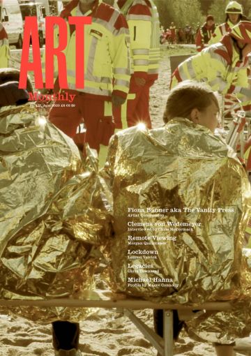
First published in Art Monthly 437: June 2020.
